Designing xBank: Accessible Mobile Banking for Generation X
Designing for accessibility means designing for everyone.
Overview
Role: UI/UX Designer — led research, ideation, interaction design, visual design, and prototyping
Timline: 3 weeks
Tools: Figma, Zoom, Notion
Timline: 3 weeks
Tools: Figma, Zoom, Notion
The Challenge
Most mobile banking apps are designed for younger digital natives. But Generation X often struggle with cluttered interfaces, limited guidance, and accessibility barriers. How might we design an experience that feels intuitive, empowering, and trustworthy for them?
The Goal
Create a mobile banking experience that helps Generation X feel confident and independent. The design should prioritize clarity, trust, and accessibility — supporting users with limited tech literacy, farsightedness, or reduced motor skills.
“I want to send money to my kids easily, but I’m always worried I’ll click the wrong thing.”
— Interview participant, 55, reflexology therapist
Understanding Generation X: Research & Insights
Approach
Before starting any design, I wanted to understand the needs, fears, and behaviors of Generation X users in the context of mobile banking. I conducted one-on-one interviews with three participants aged 50–60 who regularly use smartphones but have limited experience with e-banking.
I asked open-ended questions to uncover how they perceive digital tools, what challenges they face, and what would make them feel safer and more confident using a banking app.
I asked open-ended questions to uncover how they perceive digital tools, what challenges they face, and what would make them feel safer and more confident using a banking app.
Interview Questions Included
- Are you currently using any e-banking apps? Why or why not?
- What would make you feel more confident using one?
- What parts of using apps do you find frustrating or confusing?
- What are your financial goals or needs when using a banking app?
Key Findings
Fear of error:
Participants feared making irreversible mistakes — e.g. sending money to the wrong person or missing confirmation.
Accessibility challenges:
Farsightedness and larger fingers made small UI elements frustrating to use.
Need for clarity & control:
All users wanted step-by-step guidance and reassurance, especially confirmation steps.
Desire for independence:
They wanted to manage finances alone — not rely on younger relatives or visit the bank.
Persona: Thomas Müller
58 years · Swiss · Logistics Manager · Confident with smartphones, hesitant about digital finance
“If something goes wrong, I panic. I want to be sure before I press anything.”
“If something goes wrong, I panic. I want to be sure before I press anything.”
Goals
Send money to children and grandchildren easily
Stay independent with daily financial tasks
Feel confident that transactions are completed correctly
Stay independent with daily financial tasks
Feel confident that transactions are completed correctly
Pain Points
Small buttons make it hard to tap accurately
Navigating apps feels stressful due to lack of feedback
Has trouble reading long texts without glasses
Worries about making a mistake with his money
Navigating apps feels stressful due to lack of feedback
Has trouble reading long texts without glasses
Worries about making a mistake with his money
From Insights to Interface: Design Decisions
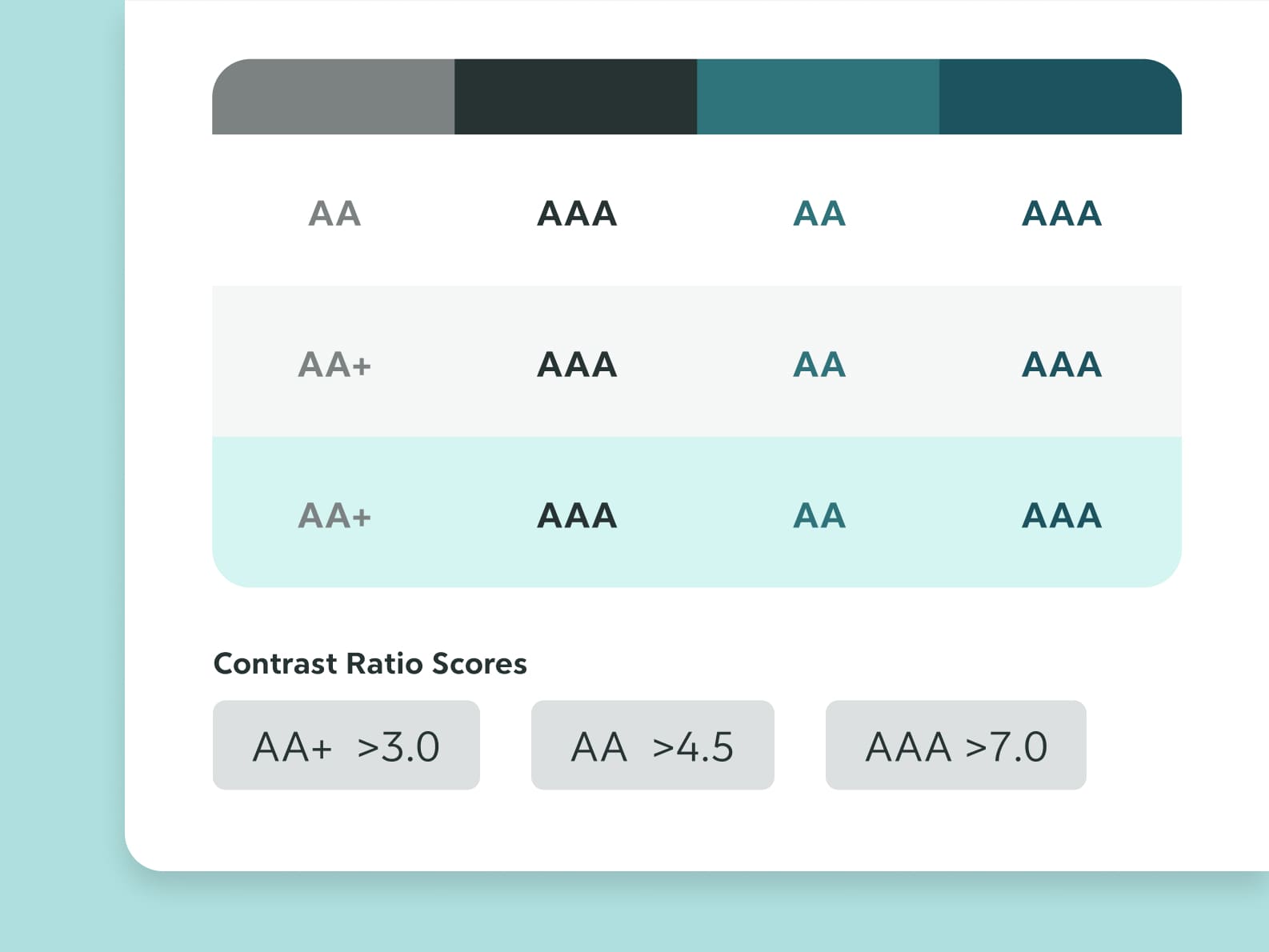
Accessible Color Contrast
Color contrast was one of the top accessibility priorities. I followed the WCAG 2.1 guidelines to ensure readability for users with low vision.
The lowest contrast ratio used is AA+ (>3.0) — only applied to large text (18px+). All other UI elements meet AA or AAA standards to support clarity and reduce eye strain.
Touch-Friendly & Memorable UI Components
I designed the login screen with unique rounded shapes to make it more memorable and distinguishable from other apps — improving recognition and recall.
All interactive elements have a minimum touch target of 56px to accommodate larger fingers and improve tap accuracy.
Input fields include example text and clear borders to make them feel familiar and obvious.
All links are underlined and color-differentiated to support users with color blindness or visual processing difficulties.
Color-Independent Visual Cues
Color is never the only way information is conveyed. To support colorblind users, I used:
Textual indicators (e.g. "+", "–" for transactions)
Contrast-based highlights (green for income, red for expenses) This ensures all users can distinguish positive and negative financial data regardless of their color perception.
Textual indicators (e.g. "+", "–" for transactions)
Contrast-based highlights (green for income, red for expenses) This ensures all users can distinguish positive and negative financial data regardless of their color perception.
Reducing Cognitive Overload
Many users reported feeling overwhelmed by complex banking apps. To build confidence and reduce stress, I used a minimalist layout with only the most essential actions visible on each screen.
Clear iconography, generous spacing, and consistent card components help guide the user’s eye and reduce decision fatigue.
Larger Touch Targets for Better Accuracy
During interviews, I learned that older users — especially those with motor limitations or who use styluses — struggle with small touch areas.
To address this, I increased the minimum touch target size from 44px to 56px, following accessibility best practices.
I also replaced the standard bottom navigation with large, tappable cards on the home screen, making it easier to access key functions without error.
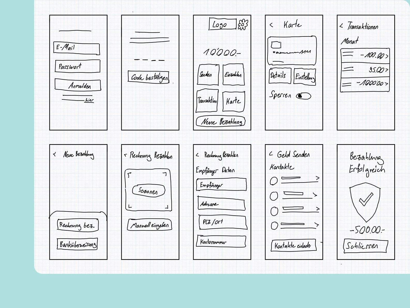
From Flows to Wireframes
Before jumping into visual design, I mapped out the core user flows needed to support the most common tasks:
Sending money
Viewing transactions
Managing a card
Making a payment
I created quick sketches to explore how to keep each screen minimal, goal-driven, and easy to navigate.
I then translated the sketches into low-fidelity wireframes and tested them with users from my target group. Their feedback led to specific improvements, such as:
Adding clearer descriptions on key screens
Introducing a visible Home button to always allow recovery
Reordering steps to better match their mental model
This step helped validate layout clarity before investing in high-fidelity UI.
Visual Design System: Clarity Through Simplicity
Colour
I chose a monochromatic color palette to keep the interface calm, focused, and distraction-free. The gentle teal tones reflect trust and clarity, while shades of grey support strong contrast and structure.
Using fewer colors helps users focus on content and actions, not decoration.
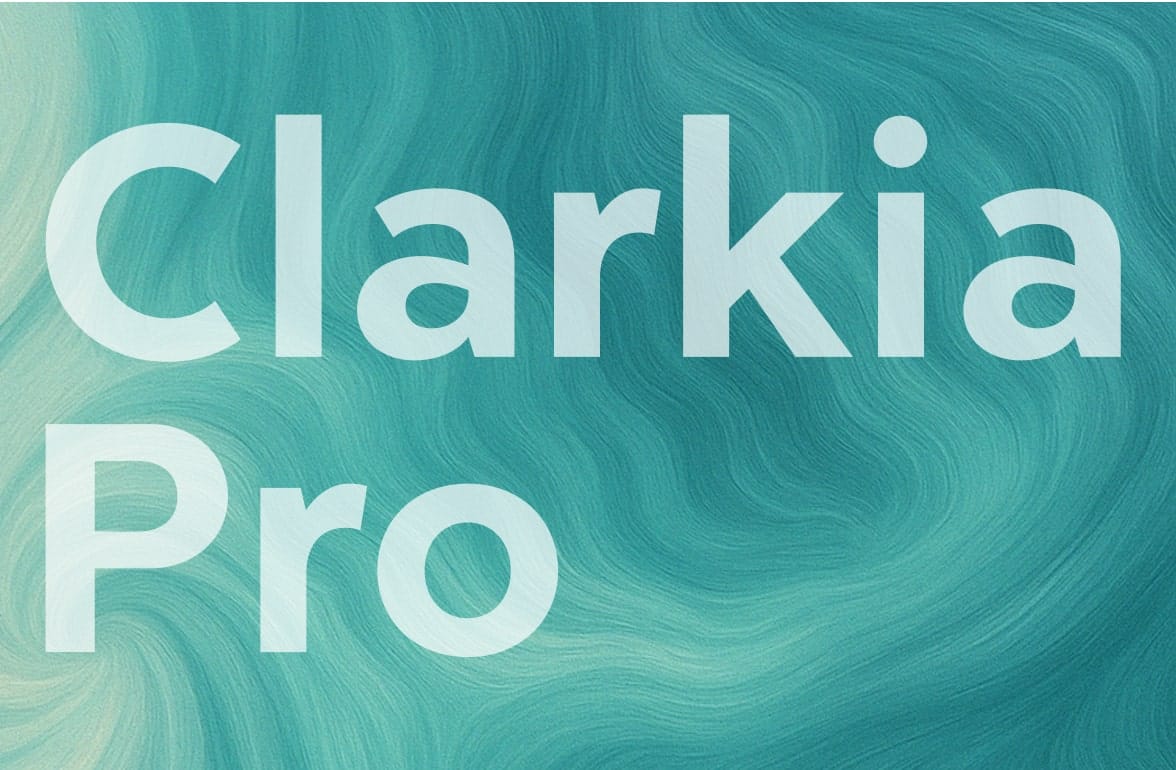
Typography
I used Clarica Pro Grotesque for its high x-height and excellent legibility at smaller sizes — especially important for farsighted users. All paragraph text uses a minimum of 18px, ensuring readability even where contrast is AA+ rather than AAA.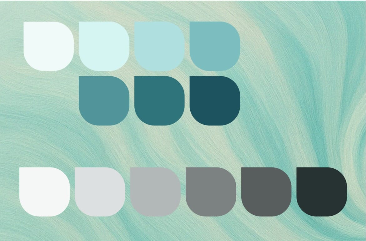
Final Design: Simple, Secure, and Accessible
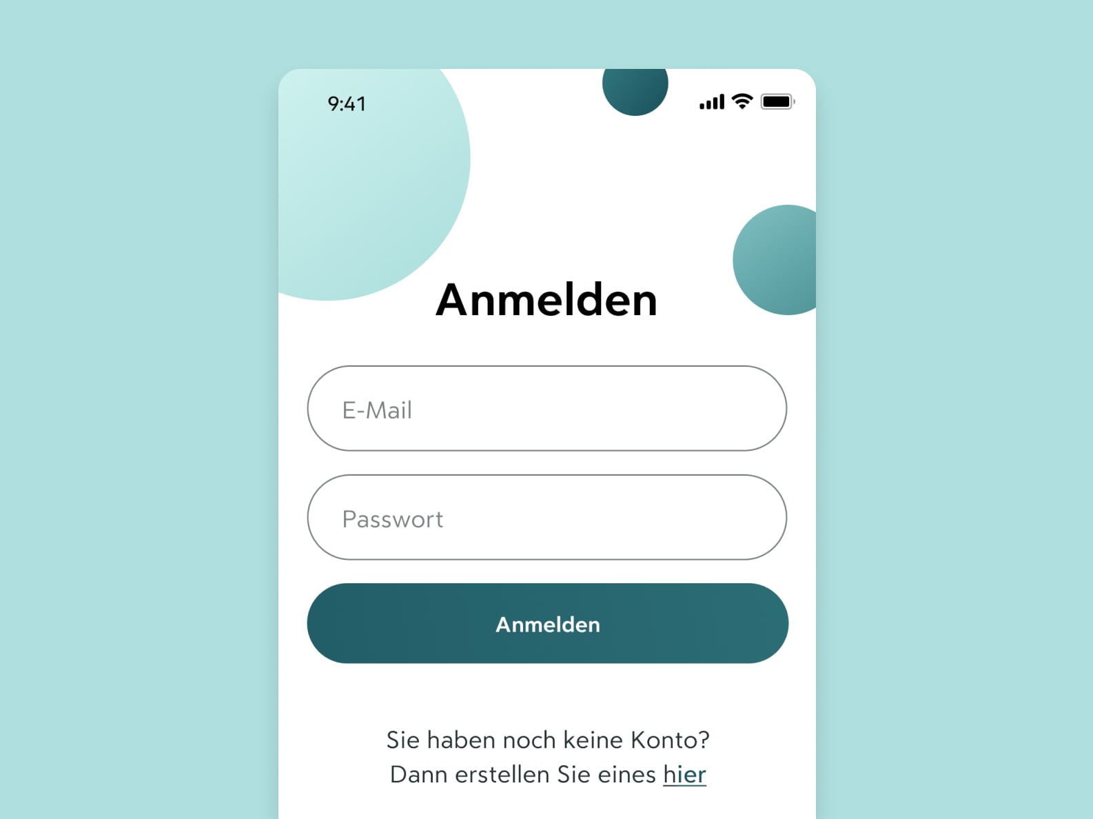
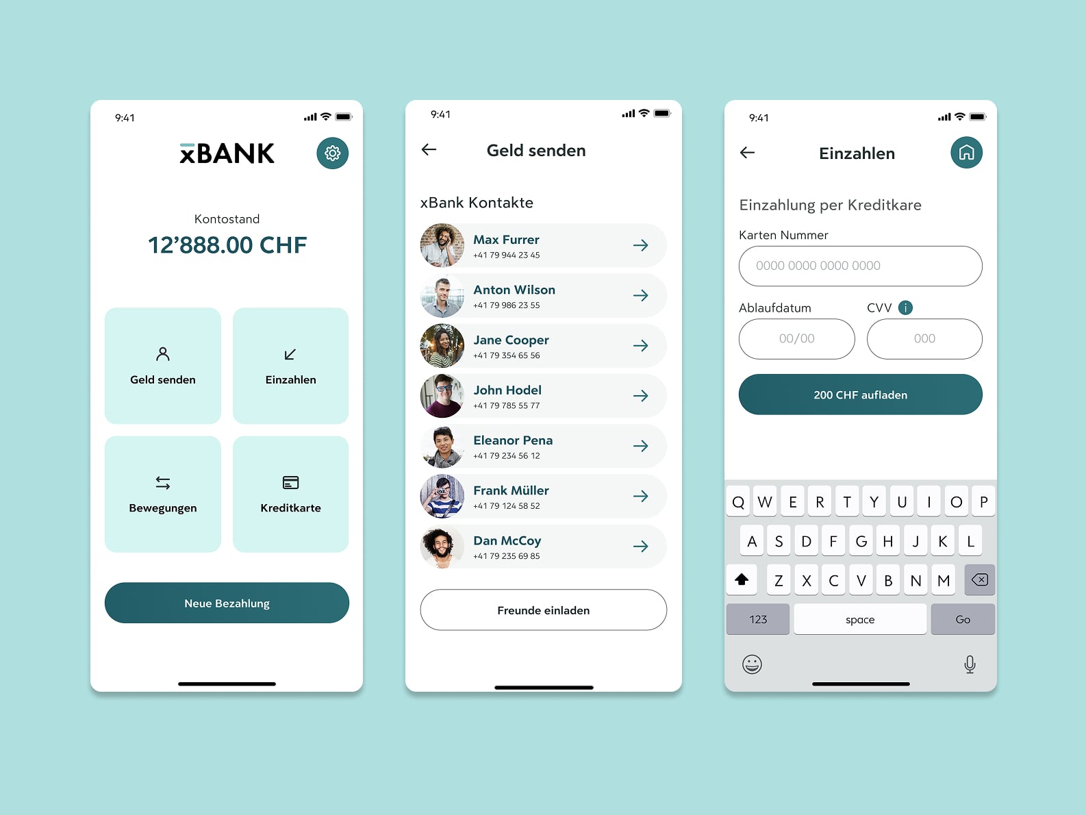
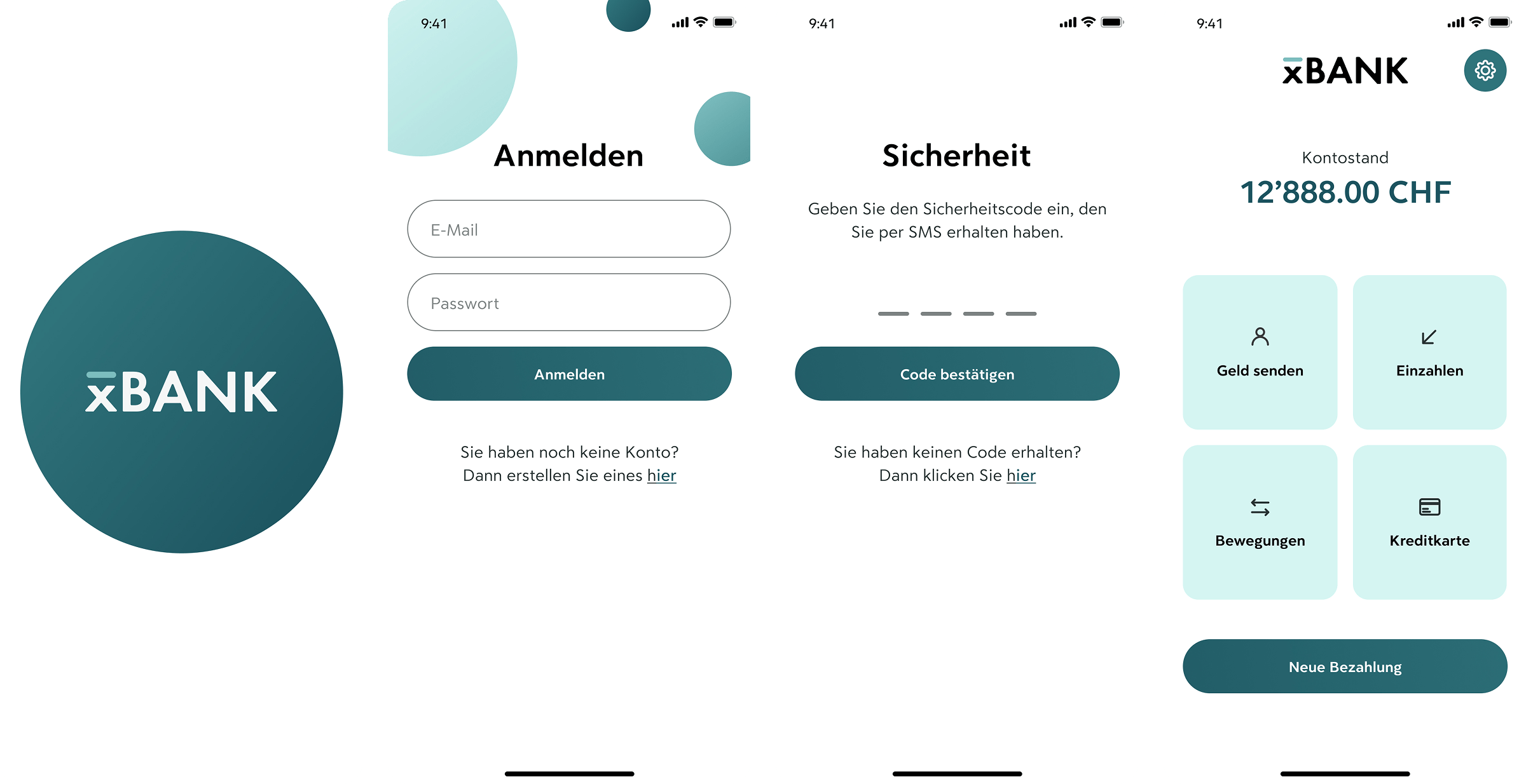
Onboarding Flow
This flow focuses on confidence and clarity from the start:Simple login screen with clear input labels
Secure code confirmation with fallback
Friendly landing screen with primary actions
💡 UX Detail: Login screen includes unique circles to make it more memorable.
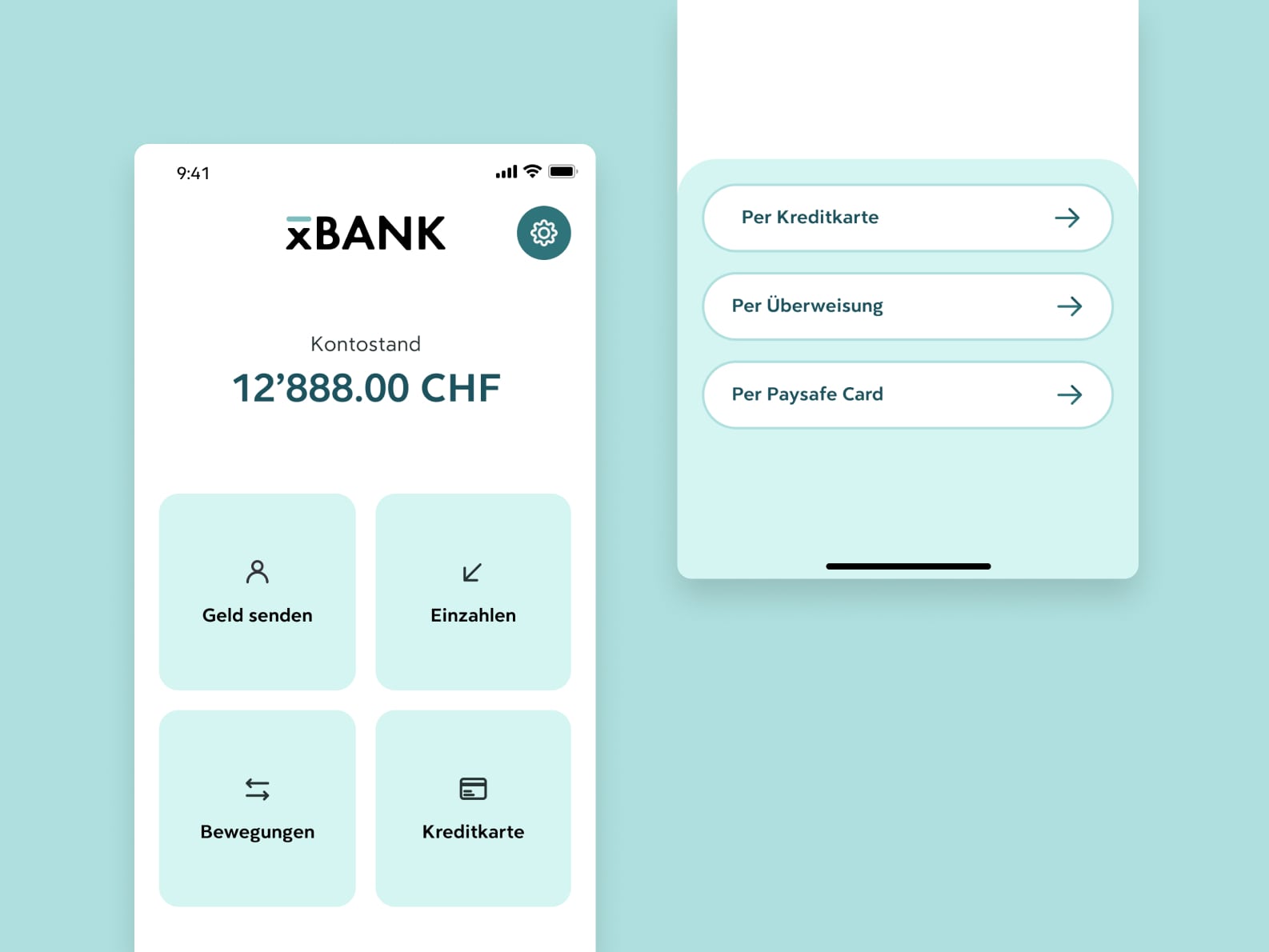
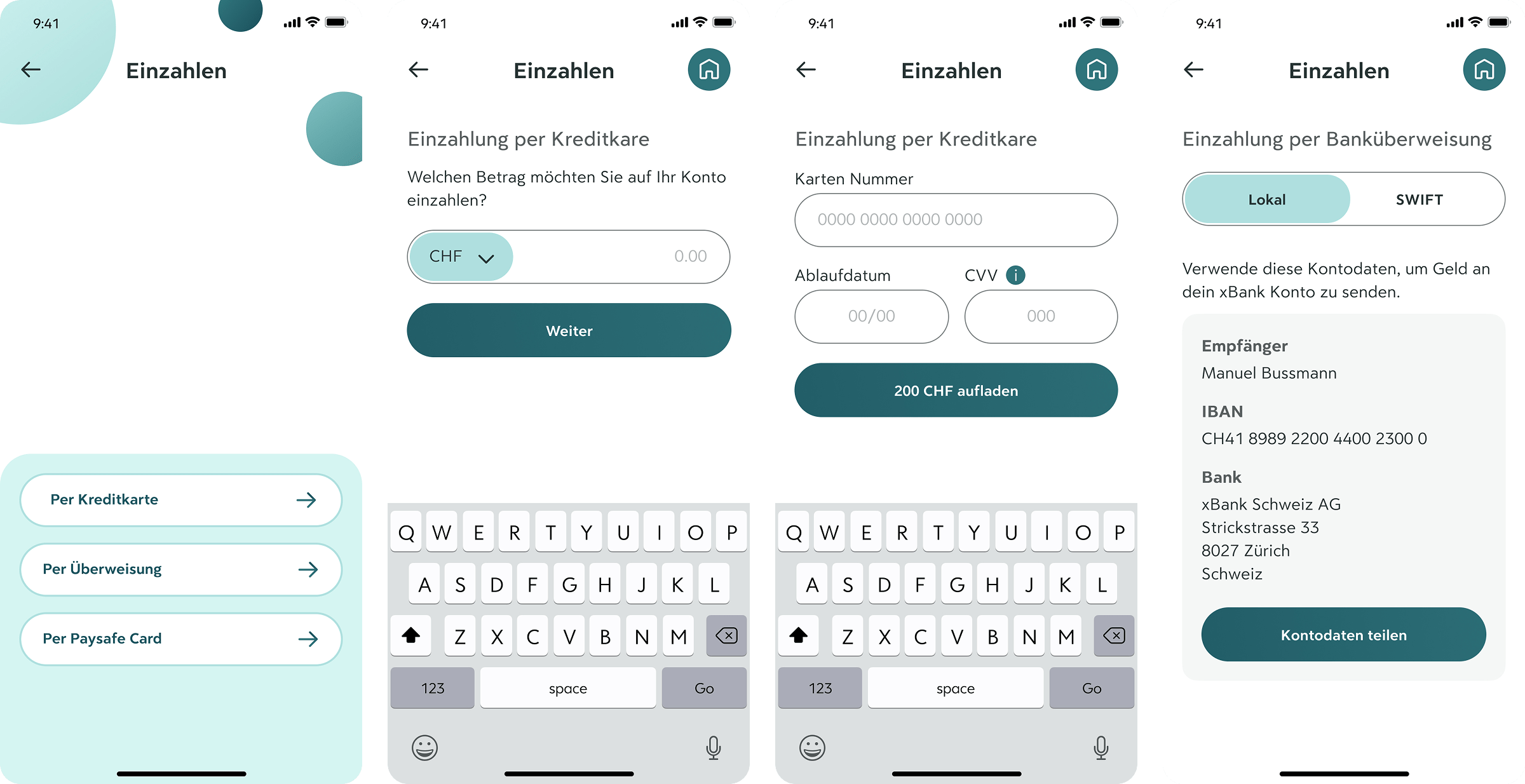
Add money to your account
Users can choose their preferred top-up method:Credit card entry uses large fields and clear CTA buttons
Bank transfer screen is simplified and readable, with essential details highlighted
💡 UX Detail: Step-by-step layout supports task focus and reduces overwhelm.
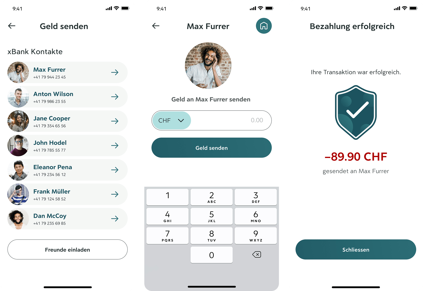
Paying a Friend
Sending money is made simple, even for first-time users:Contacts are shown as cards for easy selection
Clear confirmation message and transaction summary provide reassurance
💡 UX Detail: Color, icons, and text all reinforce transaction success.
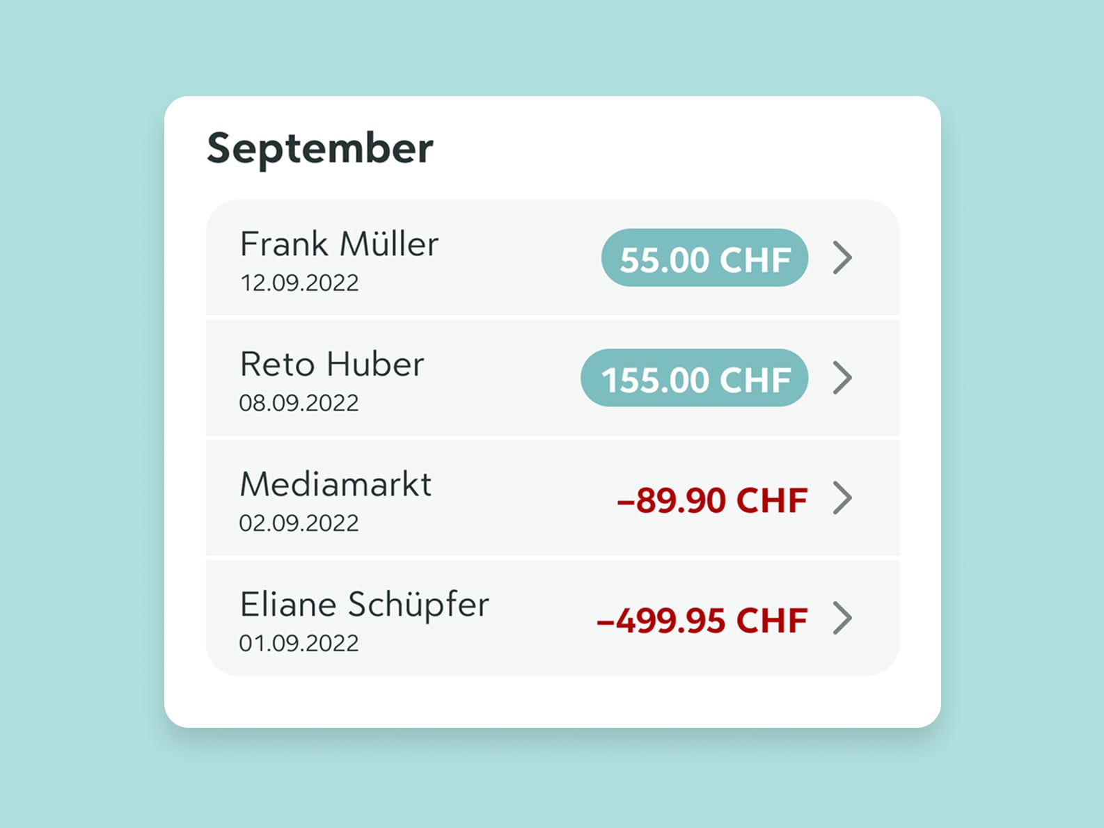
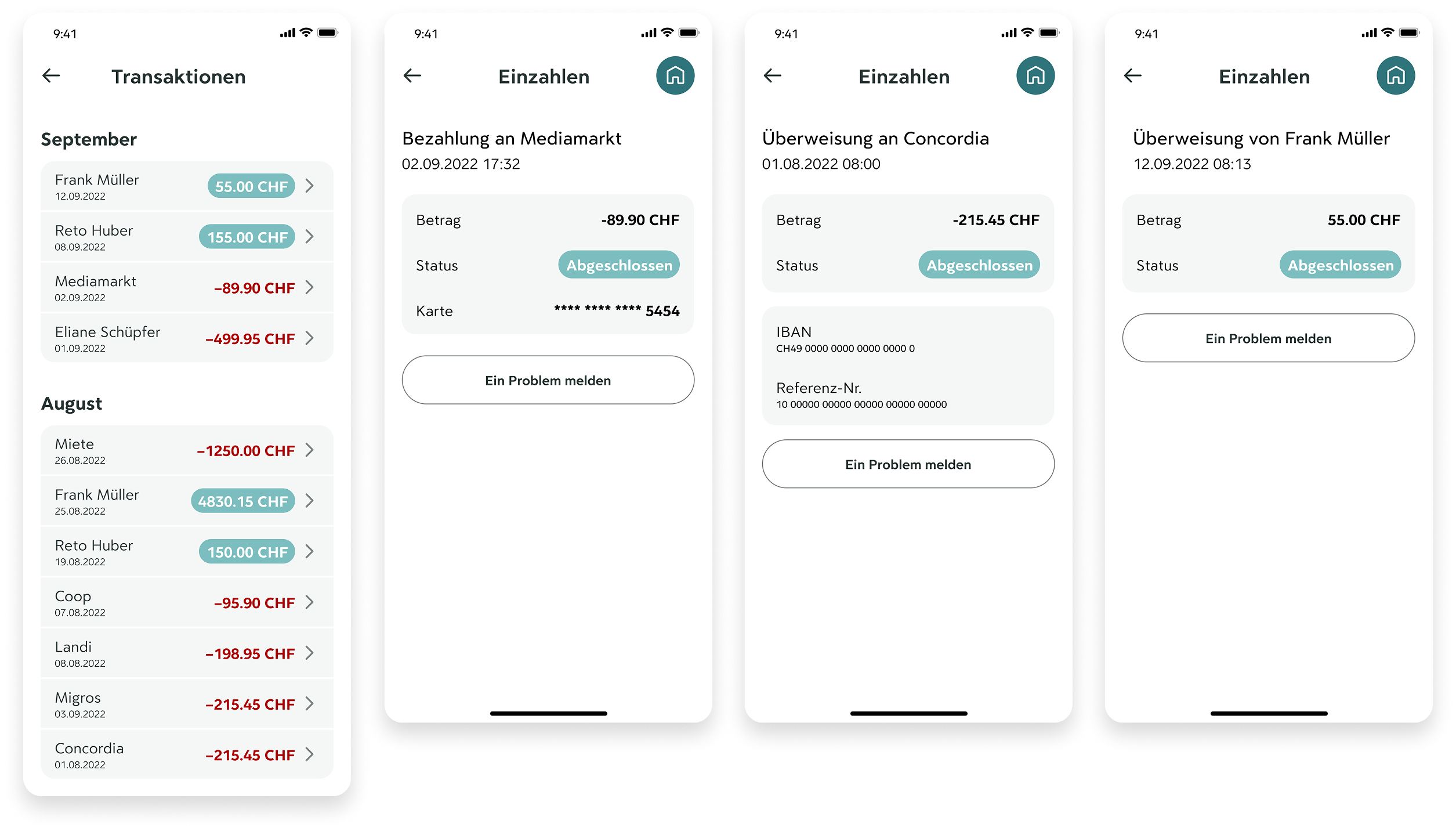
Review Transactions
The transaction overview is designed to feel clean and trustworthy.Color + symbol pairing makes income/expenses easy to distinguish
Users can tap into each transaction for more detail, with large fonts and simplified summaries
Prominent "Report a problem" button supports error recovery
💡 UX Detail: Grouping by month and status ("Abgeschlossen") provides a clear mental model.
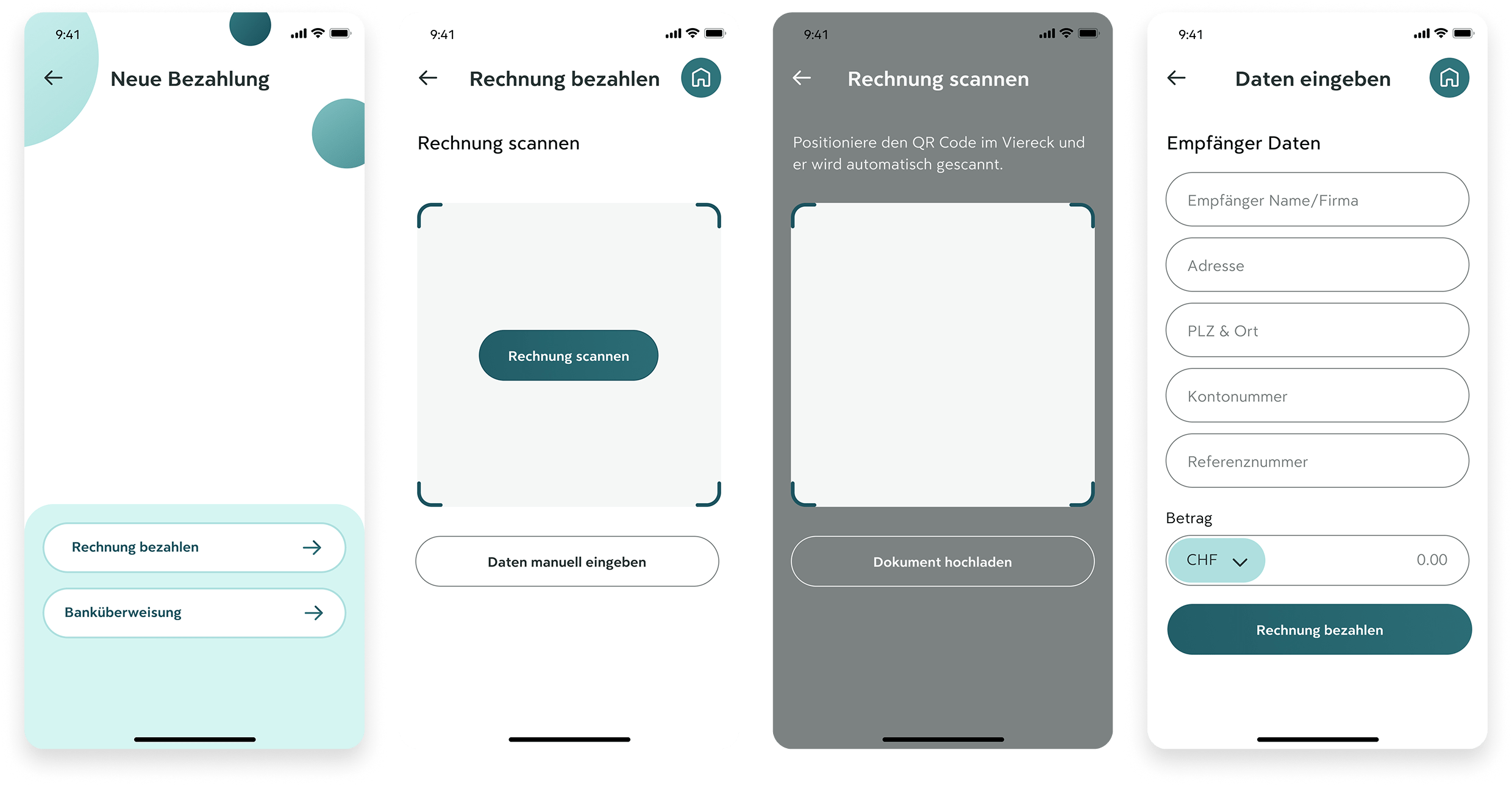
Make a payment
This flow offers two input methods based on user comfort:Scan a QR code for quick, guided automation
Manually input data with large, well-spaced form fields
💡 UX Detail: CTA buttons remain anchored and distinct to reduce error risk.
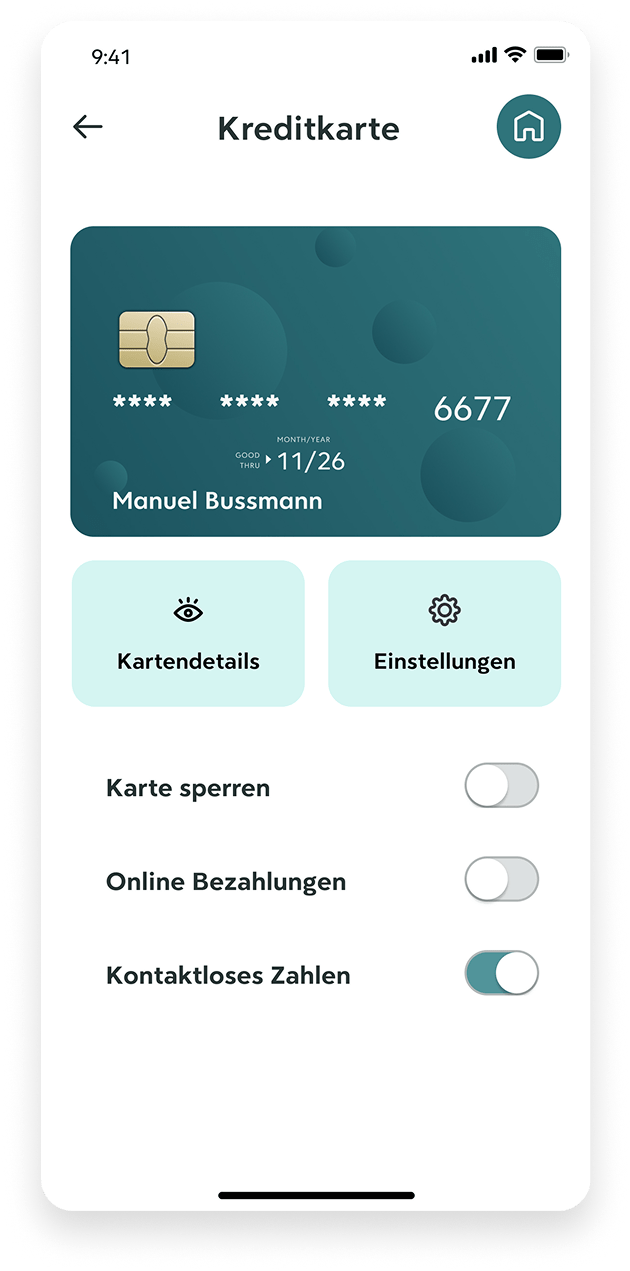
Manage card
The card management screen keeps controls straightforward:Large switch toggles for core actions
Clearly labeled tabs for “Details” and “Settings”
Card visuals and data stay readable even for users with visual strain
💡 UX Detail: Separation of actions reduces accidental taps.
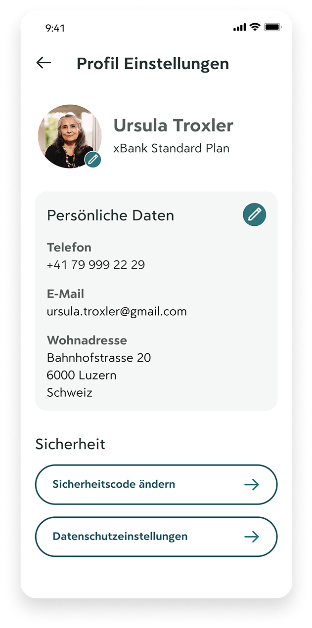
Manage Profile settings
All settings are grouped into familiar categories — contact info, security, and privacy:Sensitive fields use clean, readable layouts
Icons and consistent placement support visual memory
💡 UX Detail: Email, phone, and address are editable in-place, minimizing steps.
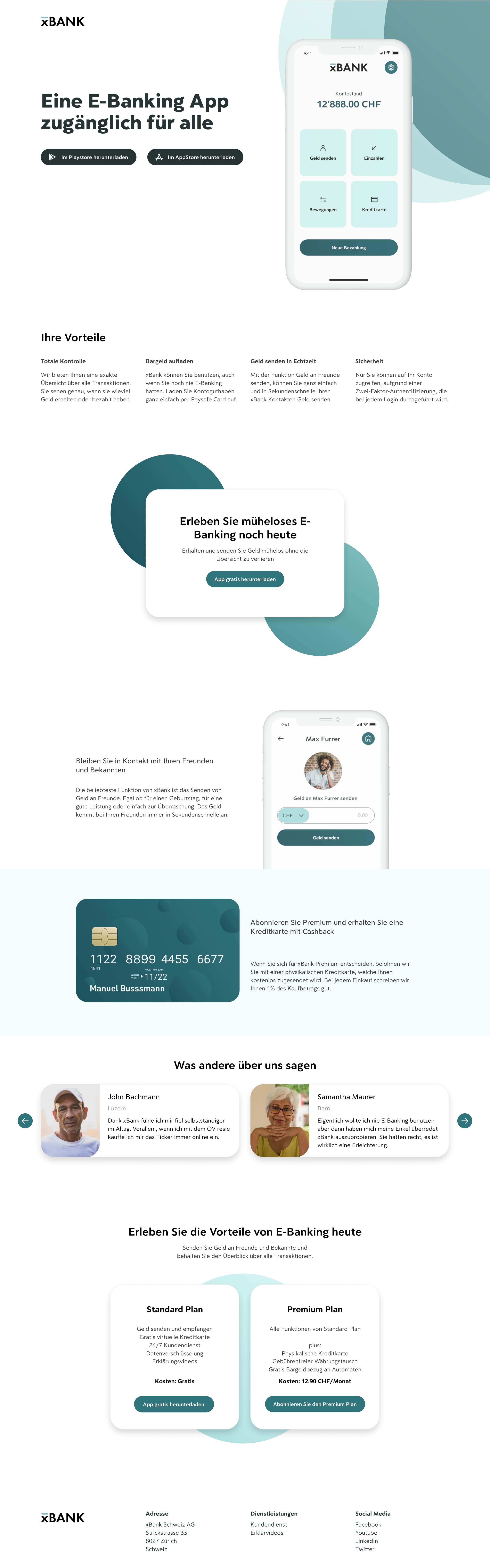
Landingpage
Let's talk
Copyright Manuel Bussmann · Imprint