Designing a Hotel Booking App:
From Competitive Research to a Clickable Prototype.
Overview
Role: UI/UX Designer — conducted competitive benchmarking, user interviews, usability testing, ideation, journey mapping, sketching, wireframing, and prototyping.
Timline: 6 weeks
Tools: Figma, Zoom, Notion
Timline: 6 weeks
Tools: Figma, Zoom, Notion
The Challenge
Current hotel booking platforms often overwhelm users with unclear navigation, confusing terminology, and hidden details (price breakdown, room specifics, cancellation policies). My goal was to simplify this complexity, creating a seamless, transparent, and trustworthy booking experience.
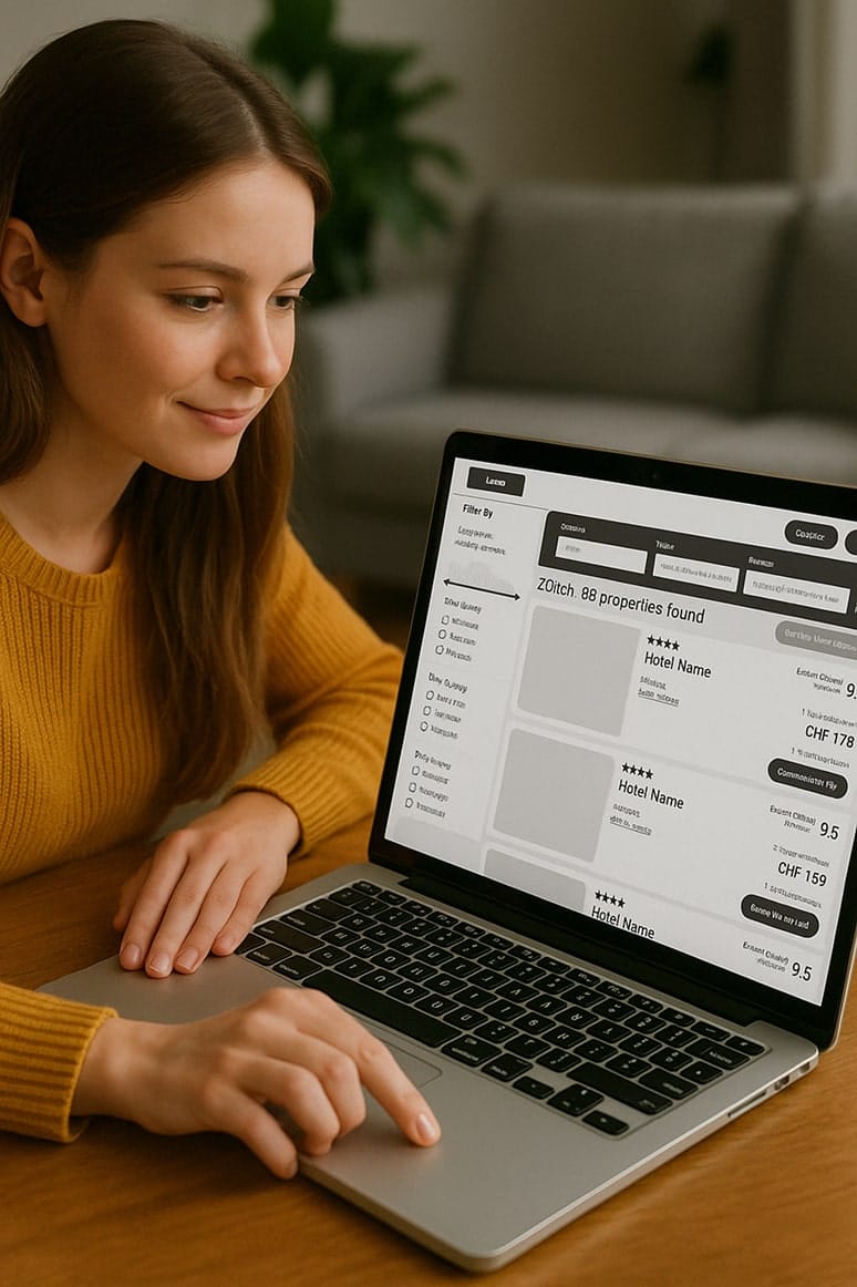
Competitive Benchmarking: Learning from Market Leaders
Approach
I analyzed three top hotel booking platforms (Booking.com, Trip.com, Airbnb) to identify their key strengths, user pain points, and successful interaction patterns. Understanding their strategies helped shape the priorities of my own design approach.
Booking.com
Strengths:
Clear, flexible search (location, dates, guests)
Effective visual hierarchy (price, cancellation policies)
Urgency cues ("limited availability," "free cancellation")
Extensive filtering options
Weaknesses:
Overwhelming amount of filter options
Certain design elements create friction mid-flow
Promoted listings aren’t clearly distinguishable from organic results
Key Findings
Strengths:
Visually engaging and consistent layout
Excellent use of storytelling in listings with host bios, detailed descriptions, and photos
Filtering for "entire place" adds clarity and control
Weaknesses:
Overemphasis on imagery sometimes hides practical info (e.g., cancellation policy, price breakdown)
Can be slow to scan for users who want quick decisions rather than browsing
Usability Testing: Observing Real User Behavior
To validate early assumptions and uncover friction points, I conducted two moderated usability tests using desktop versions of Barcello.com and DoyleCollections.com. Participants completed booking tasks for trips to Barcelona and London.
These sessions revealed what users truly value, where they get confused, and which elements inspire trust—or hesitation—along the way.
Test Goals
Understand how users search, filter, and select hotels
Identify where users feel confident vs. confused
Pinpoint trust-building and decision-blocking elements

Participant 1
Administration Manager, Age 54
“I wouldn’t book unless I know it’s free cancellation.”
“I wouldn’t book unless I know it’s free cancellation.”

Participant 2
IT Account Manager, Age 35
“I want to see more than just the bed. What’s the bathroom like? What’s outside the window?”
“I want to see more than just the bed. What’s the bathroom like? What’s outside the window?”
Room & Rate Clarity
"Double bed" and “best flexible rate” were unclear terms
It was often not obvious whether breakfast was included
Users wanted to see cancellation policies early — not at the end
It was often not obvious whether breakfast was included
Users wanted to see cancellation policies early — not at the end
Visual Information & Decision Support
Photos and TripAdvisor ratings were the most trusted elements
Users wanted to see more room photos, bathroom views, and even window views
Lack of a hotel comparison feature frustrated users
Users wanted to see more room photos, bathroom views, and even window views
Lack of a hotel comparison feature frustrated users
Navigation & Filtering
Users often struggled to filter by location or hotel features like proximity to the sea
Filters were unclear or too spread out, making comparisons harder
Many preferred selecting dates first, but this was often not supported
Filters were unclear or too spread out, making comparisons harder
Many preferred selecting dates first, but this was often not supported
Add-ons & Personalization
Add-ons were seen as clutter, especially when presented before basic booking steps
Users preferred to focus on booking first, then customize later
Users preferred to focus on booking first, then customize later
What Worked Well
Discount popups were appreciated
Add-ons like Netflix, coffee machines, or slippers were noticed and liked — when clearly presented
Clean photography and strong first impressions built trust and interest quickly
Add-ons like Netflix, coffee machines, or slippers were noticed and liked — when clearly presented
Clean photography and strong first impressions built trust and interest quickly
Mapping User Behavior to Product Logic
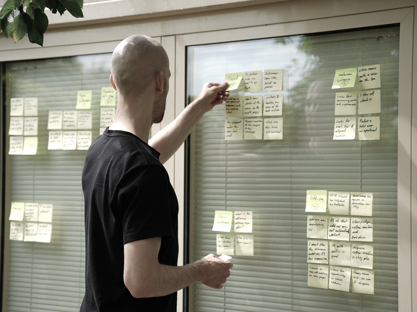
Organizing User Insights: Affinity Mapping
After conducting usability tests, I used affinity mapping to synthesize the qualitative feedback. Each sticky note captured a user quote, observation, or behavior.
Initially, the data was unordered. I then grouped insights into thematic clusters to reveal recurring patterns.
Initially, the data was unordered. I then grouped insights into thematic clusters to reveal recurring patterns.
Customer Journey Map: From Excitement to Overload
To better understand the end-to-end user experience, I created a customer journey map based on observed behaviors and direct quotes from testing. This helped identify not only what users do — but how they feel at each step.
I focused on a typical booking scenario: a solo traveler searching for a short beach getaway. The journey revealed major gaps in trust, clarity, and cognitive load throughout the process.
I focused on a typical booking scenario: a solo traveler searching for a short beach getaway. The journey revealed major gaps in trust, clarity, and cognitive load throughout the process.

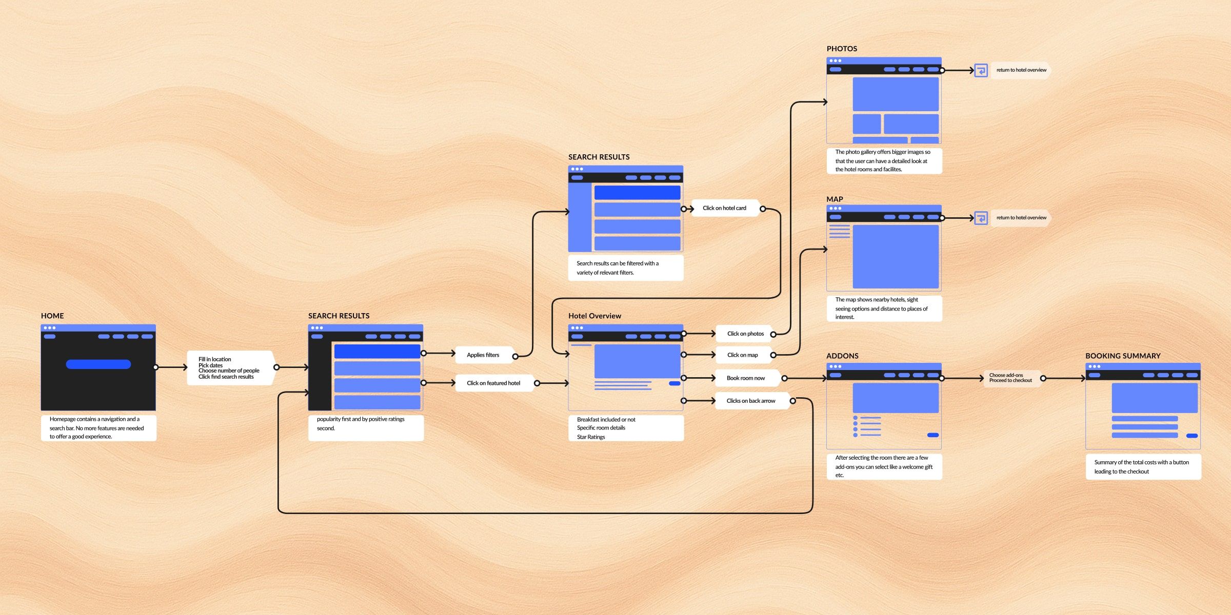
Flow Diagram: Structuring the Booking Experience
A detailed task and wire flow mapped user steps from initial search to checkout, designed to minimize confusion and enhance usability.Simple homepage: Search-focused with clear inputs.
Optimized filtering: Prioritizing user needs (e.g., location, price).
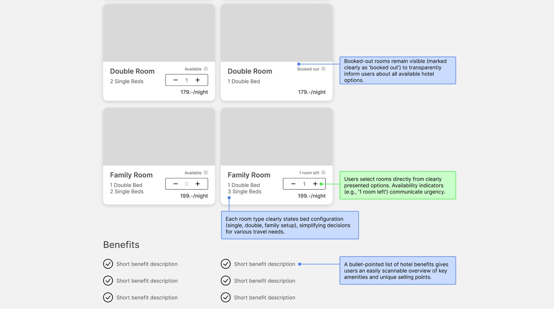
Transparent room selection: Clear availability, pricing, and visual details.
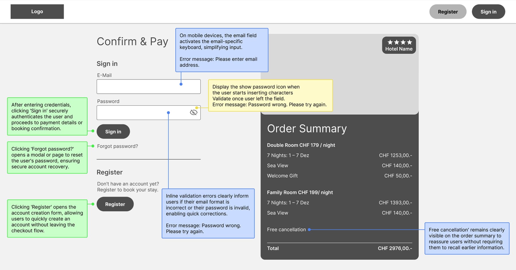
Straightforward checkout: Clearly itemized booking summary before payment.
Sketching
Before jumping into wireframes, I explored several layout ideas through quick sketches. My goal was to keep the interface minimal and intuitive, with a focus on visual hierarchy, scannability, and accessibility. These early sketches helped me test different navigation patterns, clarify screen flow, and quickly iterate before moving into mid-fidelity design.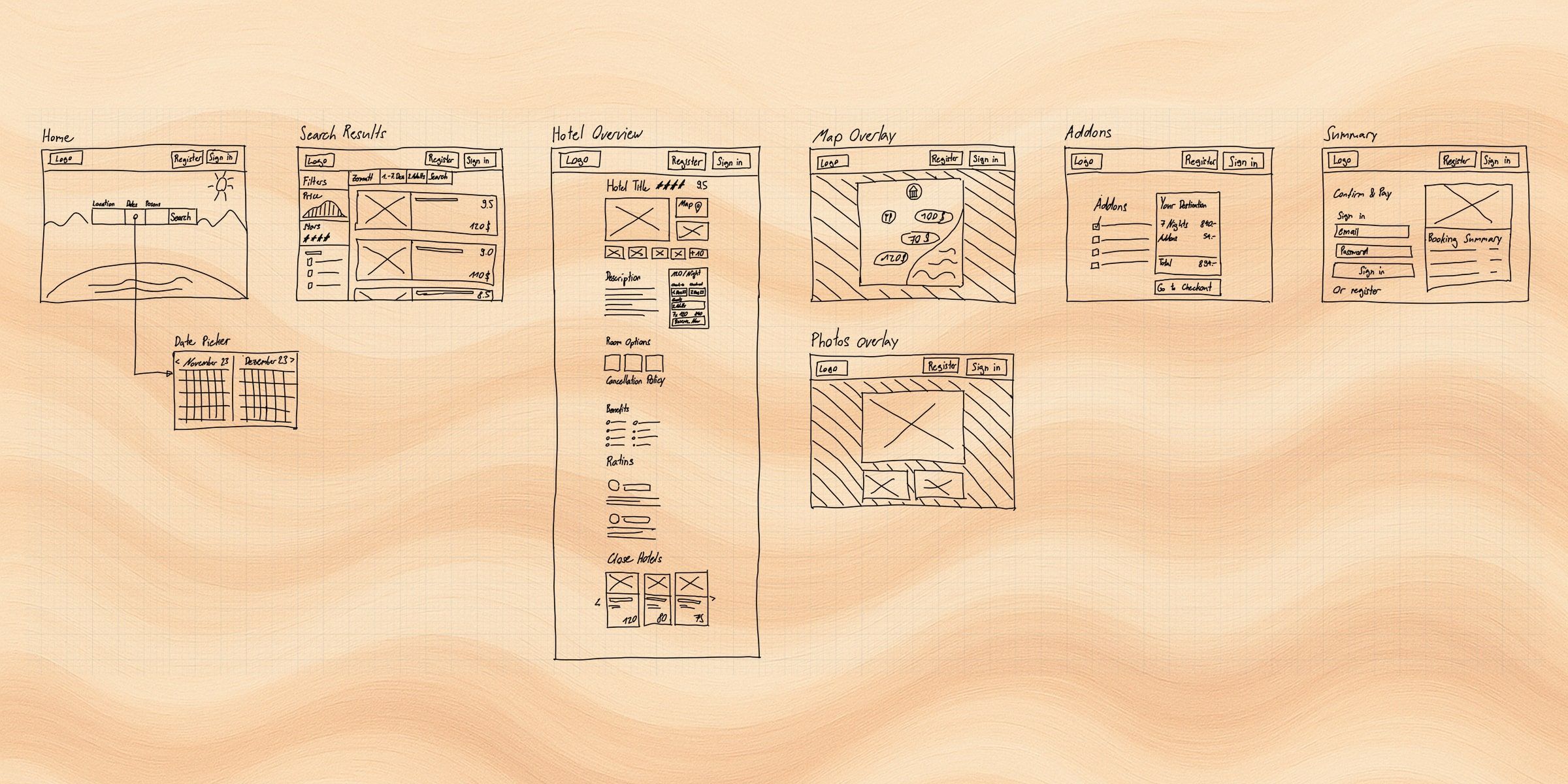
Mid-Fidelity Wireframes
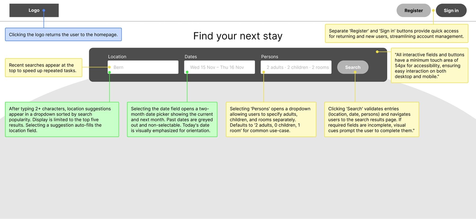
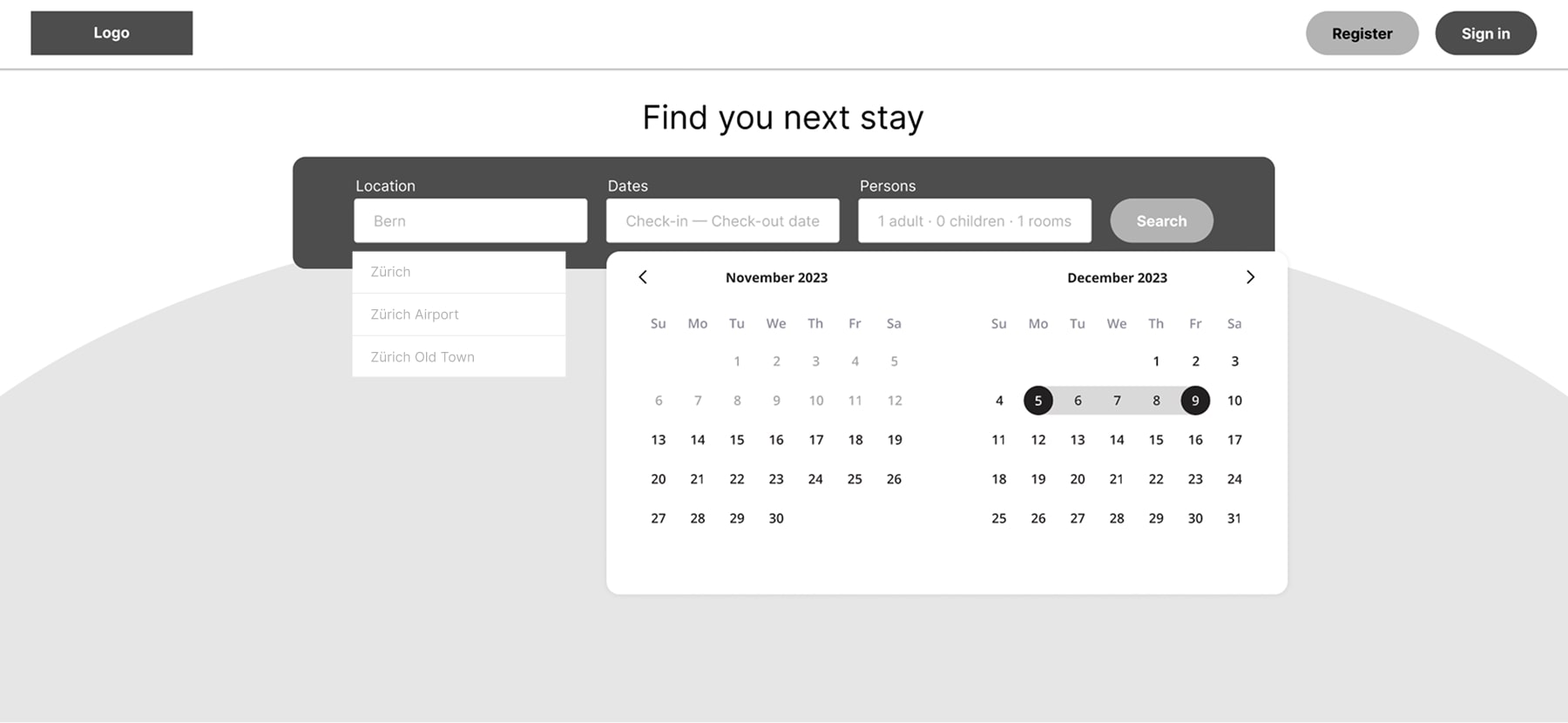
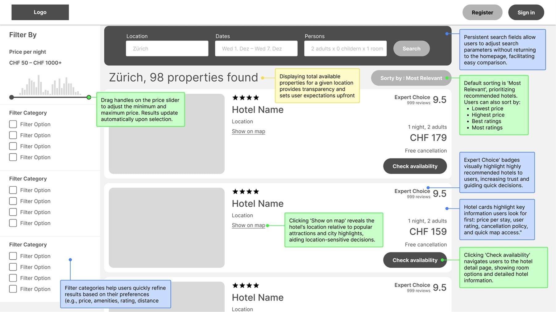
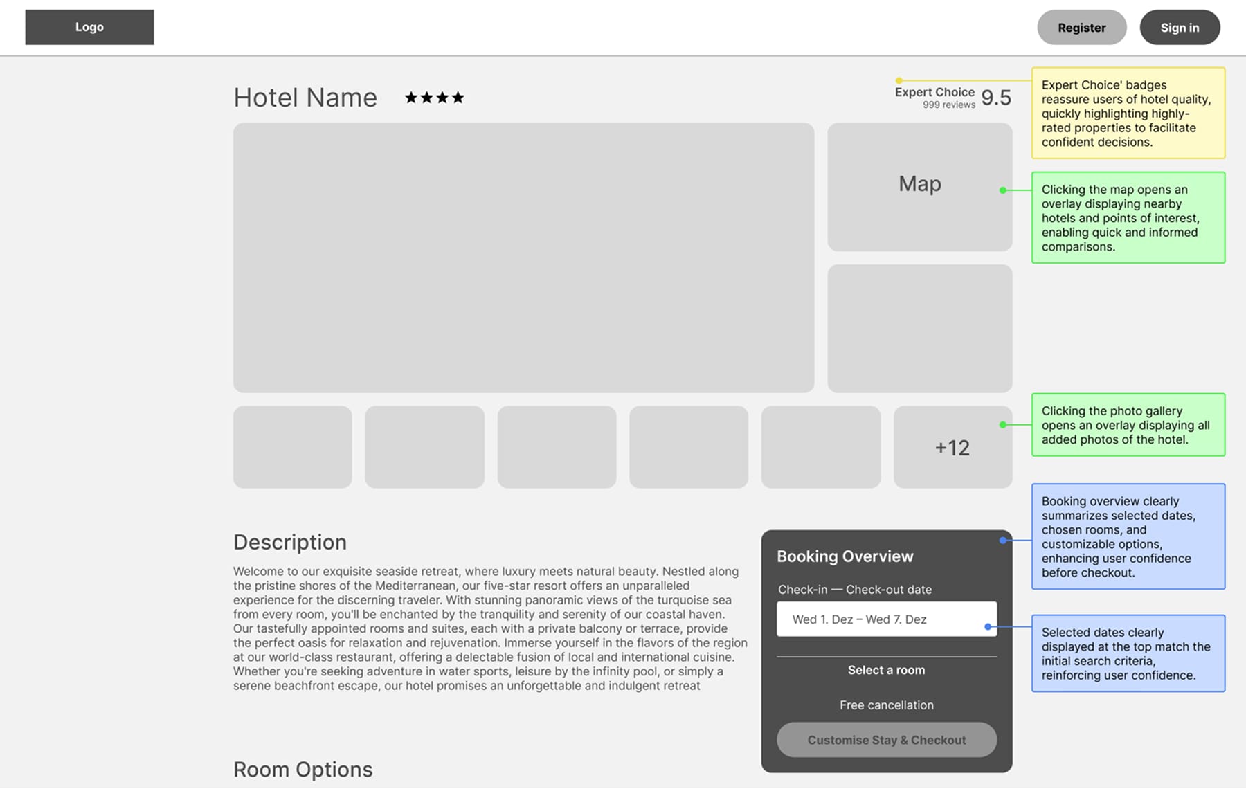
The final UI brings together research insights, journey mapping, and user testing into a streamlined, accessible booking experience. Each screen was annotated to highlight core interactions, static information, and UX rationale.I focused on keeping the interface minimal yet informative—guiding users through the flow with clear visual hierarchy, consistent patterns, and thoughtful micro-interactions. Accessibility standards like minimum touch target sizes and simplified decision-making were applied throughout to support users across different devices and abilities.
🟢 Interactions
🔵 Static Info
🟡 UX Rationale
Home Screen: Start your search
List of search results
Hotel details
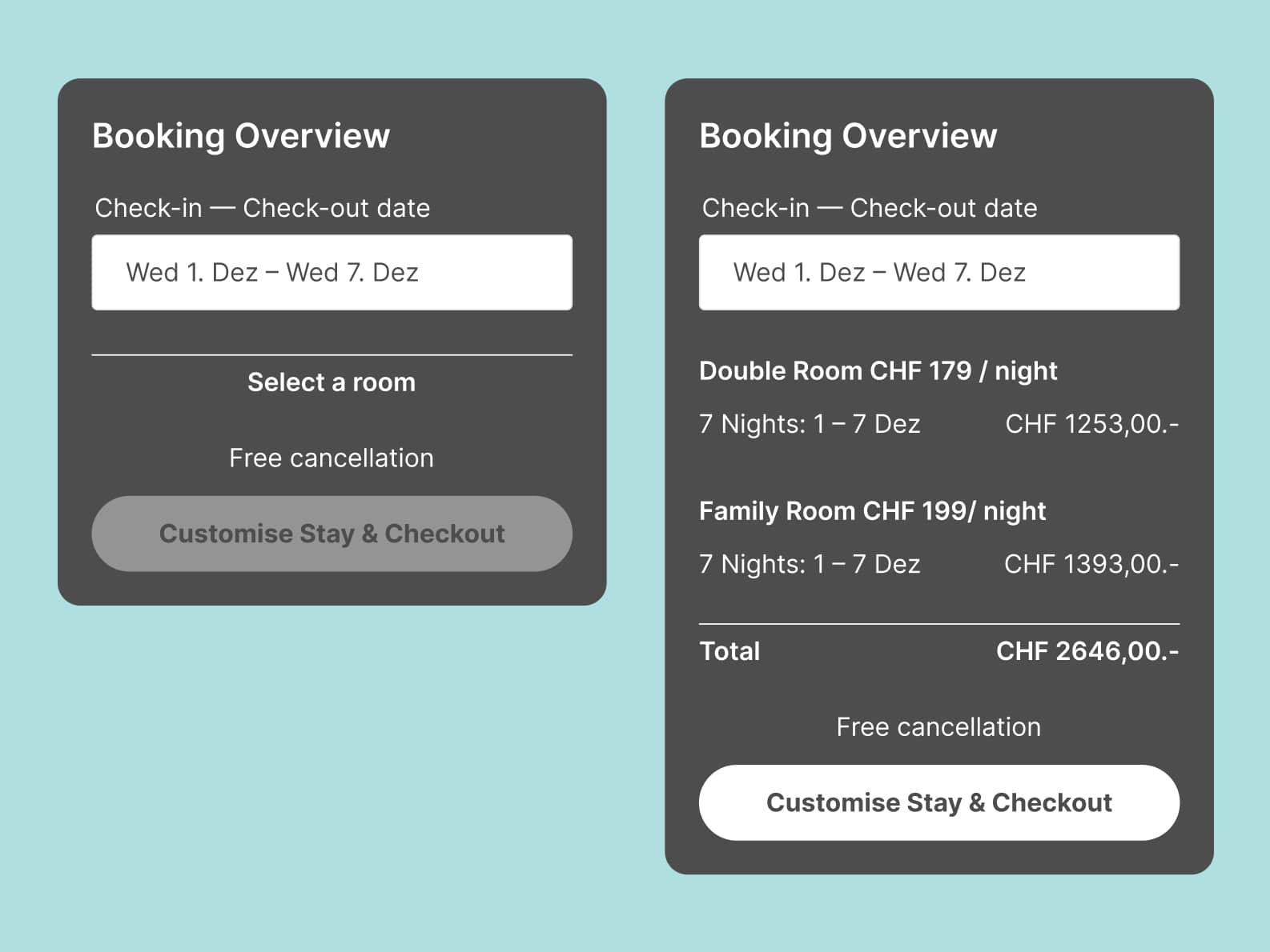
Designing for Both States: Empty & Filled
I designed both the empty and filled states of the booking overview. Designing empty states is an often overlooked detail that is relevant for the developers. To support older users and those with motor limitations, I increased touch target sizes to 56px and made the button fullwidth.
Room options section
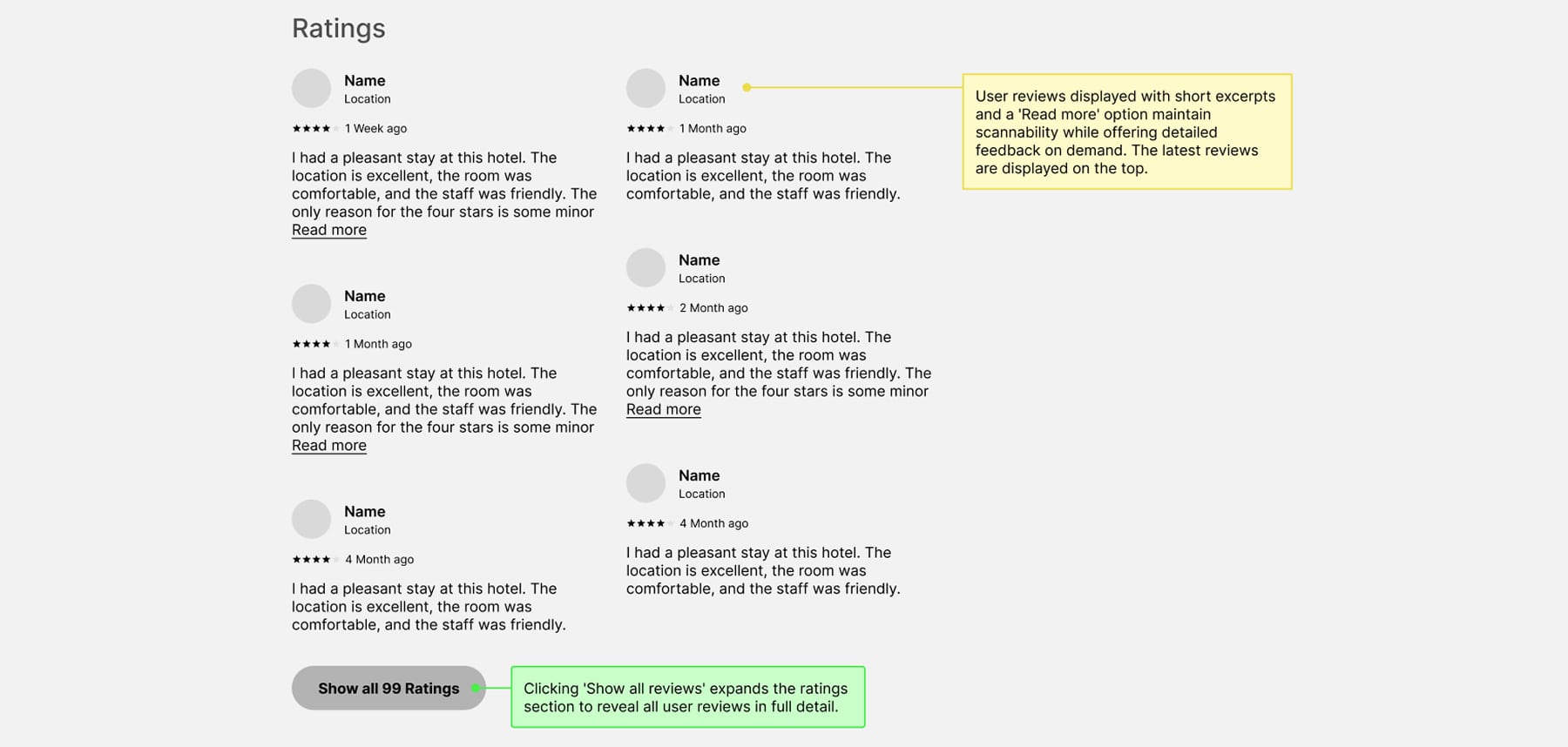
Ratings sections
Customize your stay

Review & confirm
Let's talk
Copyright Manuel Bussmann · Imprint